>

Category: Vintage Advertising

Vintage Advertising for the CNE – Canadian National Exhibition

Every summer since 1879, Toronto has been hosting the ‘Canadian National Exhibition AKA the CNE’. It is starting again this Friday and I’m excited to drop by and see the cool exhibits, eat some food and people watch. It will be awesome!

Due to my love of this big fair, I have done several posts over the years on this topic and I’m excited to bring one more to all of you….Vintage Advertising, Posters & Programmes from the 1880s to the 1960s (please scroll to the end to see my other posts).

Let’s begin!

Images: CNE Heritage
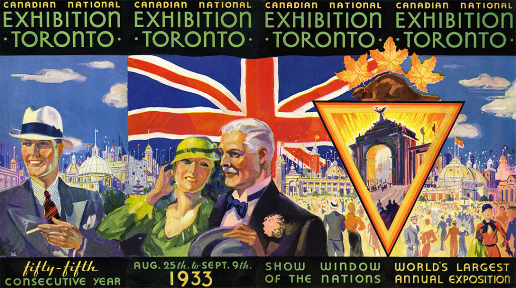
CNE Pamphlet 1933 featuring an illustration of people at the Canadian National Exhibition in 1930s fashions

1933 CNE Pamphlet –CNE Heritage

1880’s-1960’s Advertising for the CNE

Vintage Advertising, Posters & Programmes

Brief History:

The first Canadian National Exhibition took place in 1879, largely to promote agriculture and technology in Canada. Agriculturists, engineers and scientists exhibited their discoveries and inventions at the CNE to showcase the work and talent of the nation (Wikipedia). Apparently, prior to 1879, the fair had traveled throughout the province, but eventually settled where the crowds were after local stakeholders campaigned to make it a permanent city attraction (blogto.com).


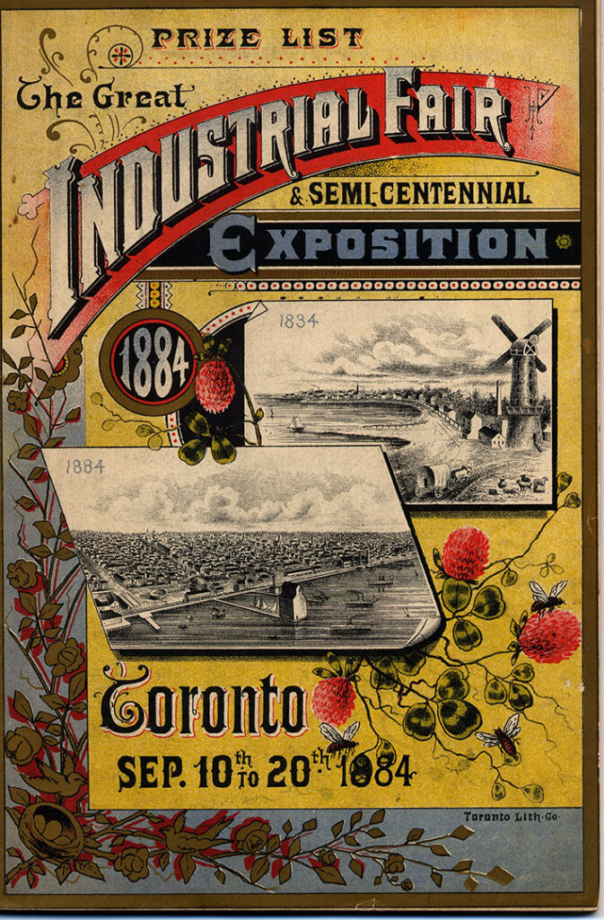
1884 Prize List Front Cover featuring the Exhibition on the Toronto waterfront.

It was also called, “The Great Industrial Fair & Semi- Centennial Exposition” in those early days of the fair

Vintage Prize List from the Toronto CNE, Canadian National Exhibition from 1884.

From CNE Heritage:

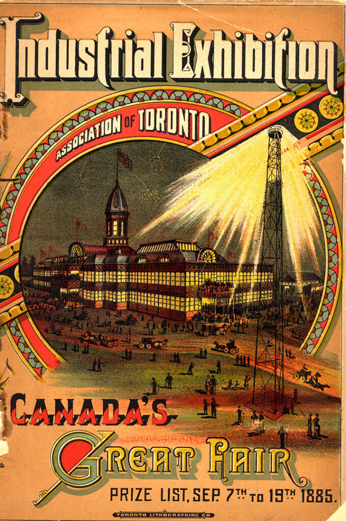
Pictured here is the 1885 Prize List Front Cover featuring the Crystal Palace & the Lighting Tower. This colour lithograph showed the illumination of the Exhibition provided by the lighting tower. Outdoor lighting was a feature of the early exhibitions.

As announced in the 1883 Prize List: “The grounds and buildings will be illuminated each evening with Electric Lights of all kinds invented up to the present time; and the Consumers’ Gas Company, of Toronto, announce that they will make an exhibit of gas lights announce that they will make an exhibit of gas lights that will eclipse the electric lights.”

Public admission to the grounds in 1885 was 25 cents. People had to walk through turnstiles to get in and, warned the prize list sternly in bold type. Each person must be provided the proper change before entering.

1880's Canadian National Exhibition, CNE Advertisement-1885 Prize List Front Cover featuring the Crystal Palace & the Lighting Tower. This colour lithograph showed the illumination of the Exhibition provided by the lighting tower. Outdoor lighting was a feature of the early exhibitions.

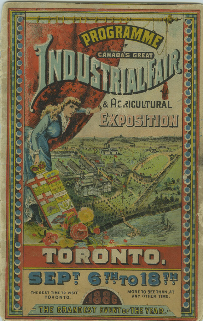
1886 programme.

Programme Cover, 1886 for the CNE, Canadian National Exhibition

In 1920, the Canadian National Exhibition had a parking area for 10,000 cars as seen in this vintage postcard image.

1920s vintage postcard: In 1920, the Canadian National Exhibition had a parking area for 10,000 cars as seen in this vintage postcard image featuring early 1920s cars.

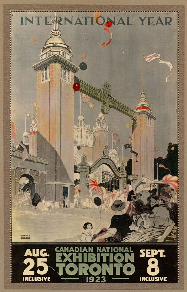
1923 CNE Poster.

About: Featuring the Dufferin Gates & International Year. The art for this poster was created by Stanley F. Turner (1883-1953).

1923 CNE Poster-Canadian National Exhibition featuring the Diamond Jubilee of Confederation.

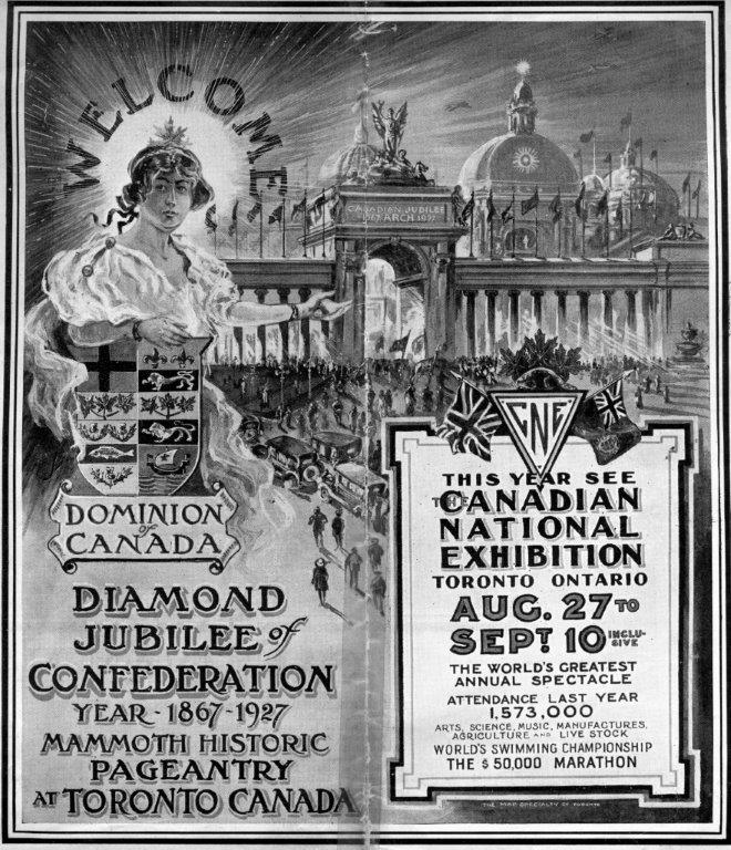
1927 CNE Pamphlet Cover for the Diamond Jubilee of Confederation.

1927 CNE Pamphlet Cover for the Diamond Jubilee of Confederation

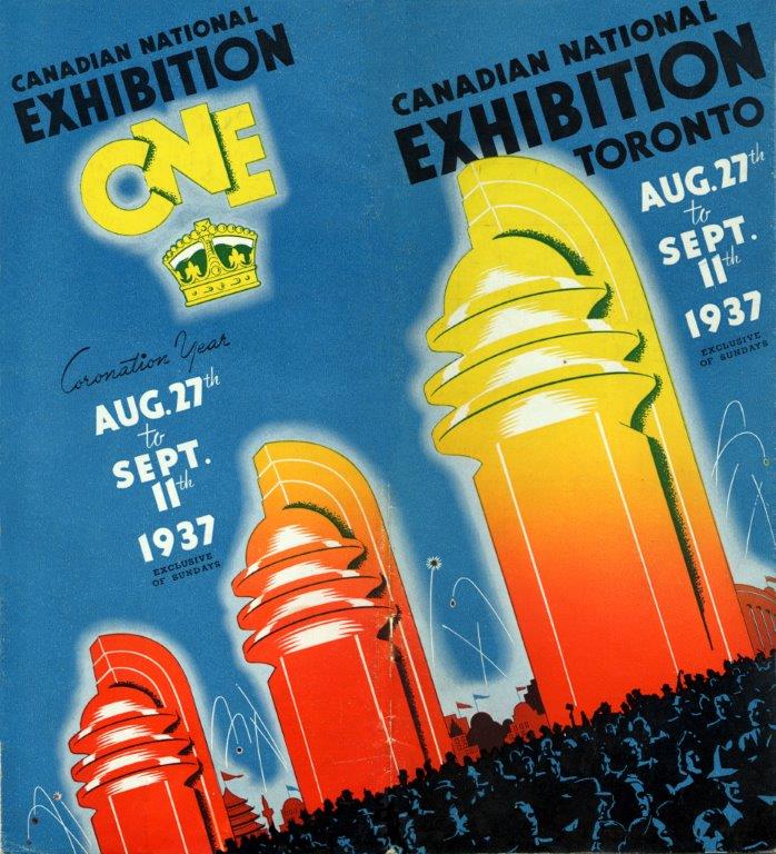
1937 CNE Brochure Cover-“Coronation Year”.

The year 1937 was a challenging one for the Canadian National Exhibition Association, due to the outbreak of Polio (Source).

An excerpt from the 1937 Annual Report:

“Provincial and municipal health authorities took prompt measures to control and abate the epidemic. Indeed, the advisability of closing the Exhibition’s gates to children was seriously discussed. Railway and steamship excursions to Toronto were cancelled and tourists were warned and sometimes unduly alarmed at ports of entry. As a precautionary measure the Exhibition management cancelled the baby show which had attracted one thousand entries and notified the health departments of its eagerness to co-operate to the fullest possible extent in overcoming the menace to public health.”

1937 CNE Brochure Cover

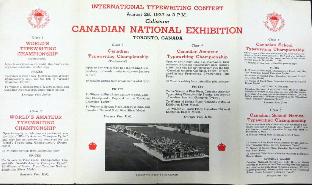
“International Typewriting Content” – 1937 Typewriting Competition Pamphlet (Inside Content)

1937 Typewriting Competition Pamphlet (Inside Content)

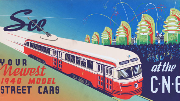
“See the newest 1940 model Street Cars at the CNE”. 1940’s vintage TTC ad (Toronto Transit Commission).

1940s vintage ad for Toronto Transit Commission TTC see the newest 1940 streetcar model at the Toronto CNE

Source: BlogTO

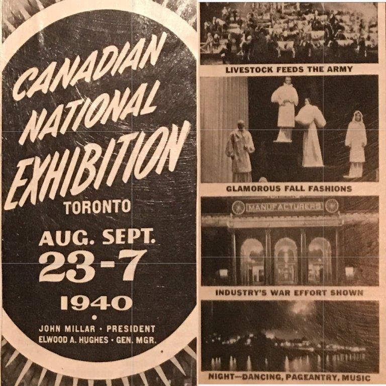
CNE Ad in Chatelaine Magazine, 1940.

1940s vintage ad: CNE Ad in Chatelaine Magazine, 1940

1941 Program.

The towering figure of a man rolling up his sleeves in this poster is a detail from a large oil painting by Toronto artist, Grant Macdonald (1909-1987).

The CNE commissioned Mr. Macdonald to create this painting for use in the poster and programme cover that year. The CNE’s theme in 1941 was “Canada’s Anwer” (its answer to fascism in Europe). Grant Macdonald used a soldier by the name of J.C. Cockburn of Toronto as his model. The Toronto Star sold prints at the 1941 CNE to benefit the Red Cross British Bomb Victims Fund. The painting was also offered for sale the same year also to raise money for the Bomb Victims Fund (Source-CNE Heritage)
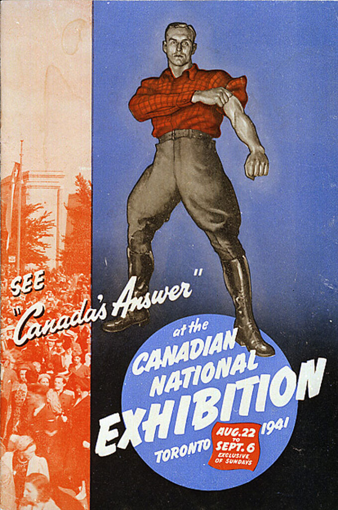
1941 Program.

The towering figure of a man rolling up his sleeves in this poster is a detail from a large oil painting by Toronto artist, Grant Macdonald

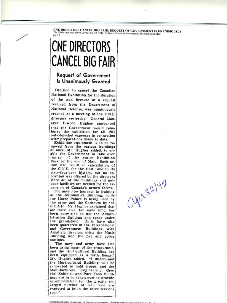
This article from the Globe and Mail provides details about the closure of the CNE during the Second World War from 1942 to 1946. Although the war ended in 1945, it took quite a while for the military to move out, which is why the CNE was not staged in 1946. Prime Minister Mackenzie King re-opened the fair at the Bandshell in 1947 (Source: CNE Heritage).

1942 Article about the Cancellation of the CNE during WW2

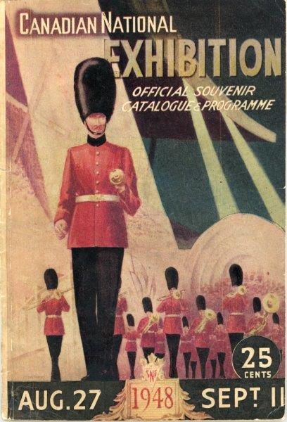
1948 CNE Programme Cover featuring a band playing at the CNE Bandshell.

1940s vintage advertising: 1948 CNE Programme Cover featuring a band playing at the CNE Bandshell.

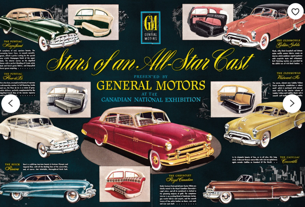
1950 General Motors Product Line. Canadian National Exhibition 2 page magazine ad.

1950s advertising: 1950 General Motors Product Line-CNE-Canadian National Exhibition Original 2 Page Magazine Ad

Source: Etsy – OriginalAutoAds

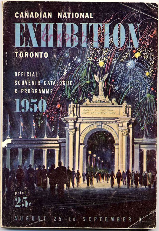
Fireworks over the Princes Gates. 1950 Official CNE Souvenir Catalogue & Programme.

The 1950 CNE program

Source: Bertie the Brain

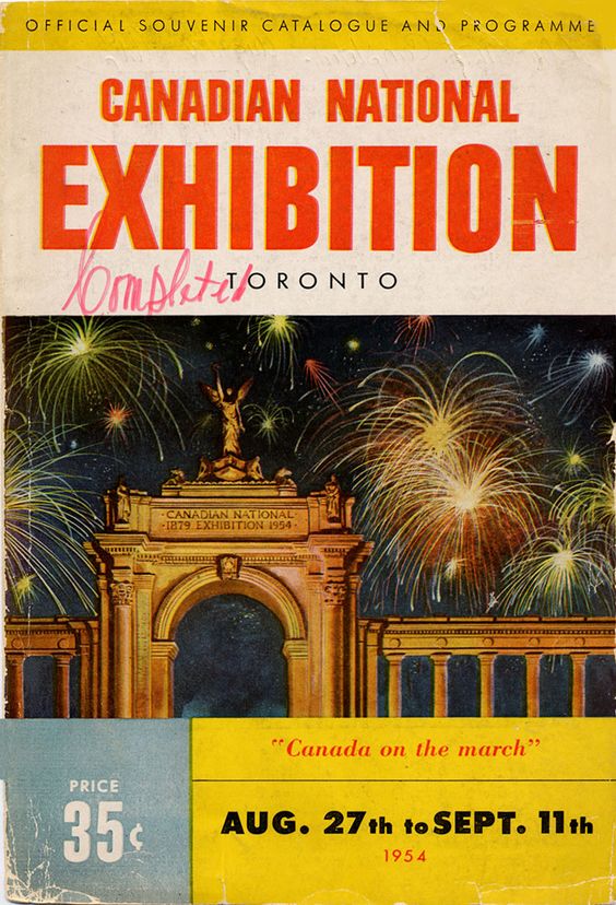
1954 Programme. “Canada on the March”.

1954 Canadian National Exhibition Toronto Programme.

Source: Pinterest

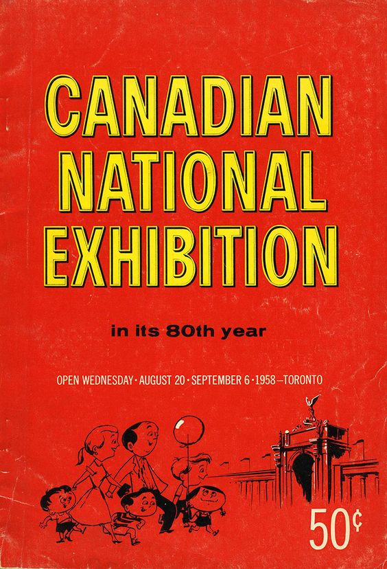
1958 program – “Canadian National Exhibition in its 80th year”.

1958 Canadian National Exhibition Toronto Programme, celebrating 80 years featuring an illustration of a family going to the CNE

Source: Pinterest

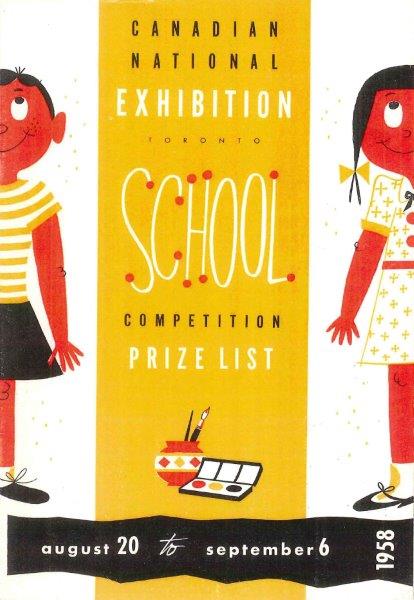
1958 School Competition Prize List featuring an illustration of an adorable boy and girl.

1950s Canadian National Exhibition aka the CNE, School Competition Prize List from 1958 featuring an illustration of a boy and girl

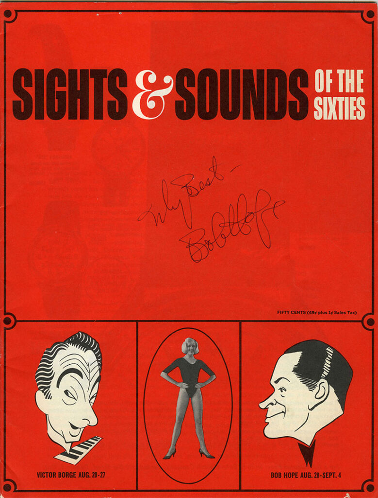
1965 CNE Programme Cover, signed! “Sights & Sounds of the Sixties” featuring an illustration of Victor Borge & Bob Hope (and Bob’s signature).

1965 CNE Programme Cover, signed! "Sights & Sounds of the Sixties" featuring an illustration of Victor Borge & Bob Hope

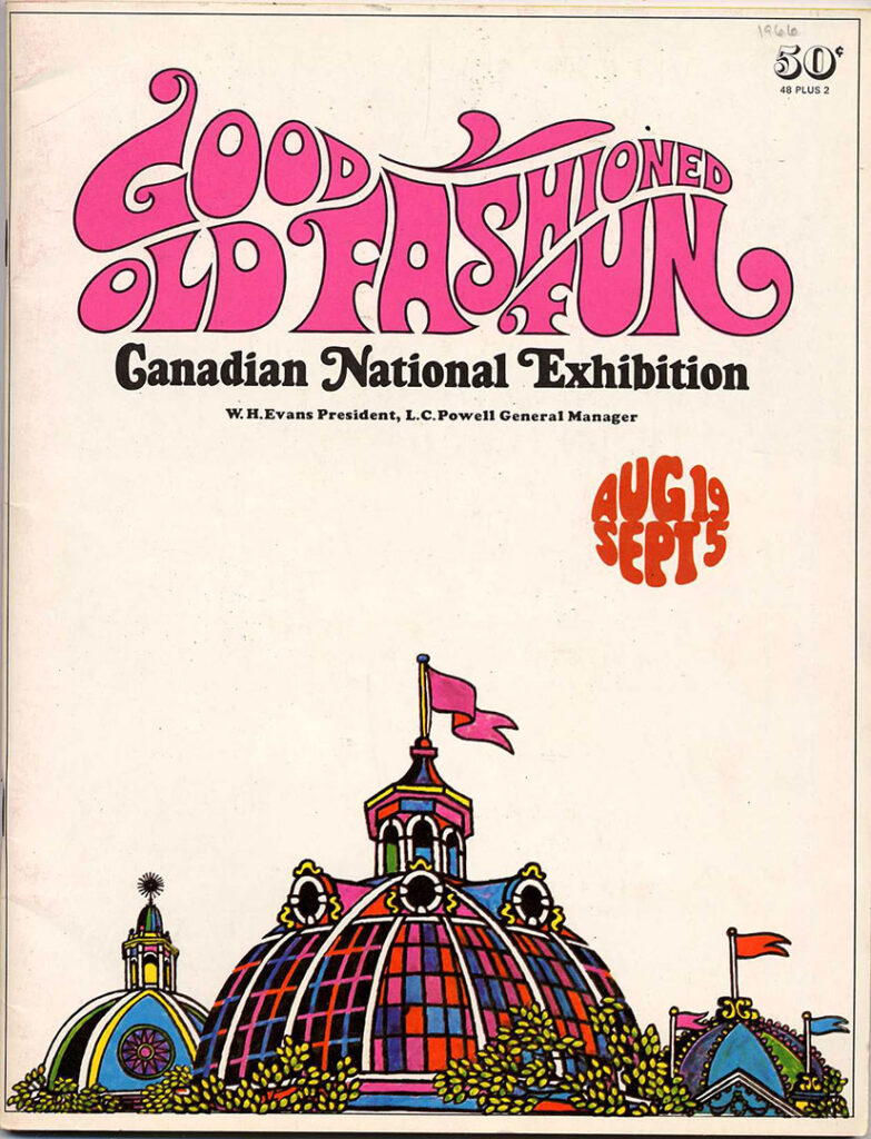
The CNE gets GROOVY! 1966 program cover.

The CNE gets GROOVY! 1966 program cover for the Canadian National Exhibition.

I hope you enjoyed this fun post, even if you have never been to the CNE!

Please share in the comments section any thoughts you wish to share about this post, I love hearing from my readers.

FURTHER READING: A collection of past CNE posts I have done and a link to my Toronto archive posts….

Thanks for dropping by!

Liz

Disclosure: Some of the links on my blog from Etsy , eBay, are Affiliate Links, meaning, at no additional cost to you, I will earn a commission if you click through and make a purchase. 

Vintage Matchbook Advertising

Do you remember the days of paging through a matchbook collection (I do!)? Matchbooks have long been a source of fascination for many, with their unique designs and array of colors. From the simple to the obscene, they offer a nostalgic look back to a bygone era.

In this article, we’ll take a journey into the past and explore not only the fantastic designs but also a little of the history of the restaurants, hotels & services they advertise.

Let’s strike a match and step back in time readers!

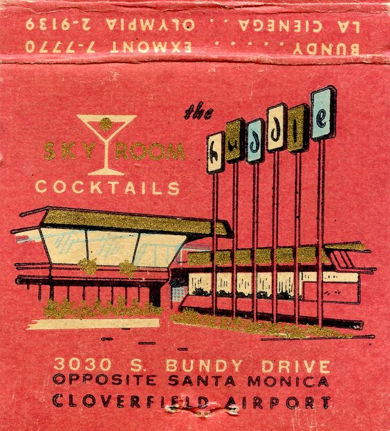
Vintage Matchbook for 'The Huddle' skyroom cocktails in Santa Monica. Fantastic Googie architecture on the matchbook ad.

Source: Pinterest


Disclosure: Some of the links on my blog from Etsy , eBay, are Affiliate Links, meaning, at no additional cost to you, I will earn a commission if you click through and make a purchase.

The Brief History of Advertising on Matchbooks

Matchbook covers have been used as a form of advertising since 1894, two years after they were patented. Many historians point to the Mendelson Opera as the first to use matchbooks for advertising purposes; they hand wrote their promotional information on blank matchbook covers made by the Binghamton Match Company between 1893/94.

Inspired by the Opera’s innovation, Diamond Match salesman Henry Traute began approaching manufacturers to advertise their products on his company’s matches, promoting them as something that would be viewed by their users many times a day. Among the first companies to order advertising matchbooks were Pabst beer, American Tobacco Company and Wrigley’s Chewing Gum. He also encouraged his customers to give away matchbooks as a promotional item (Source).

Vintage Matchbook Advertising

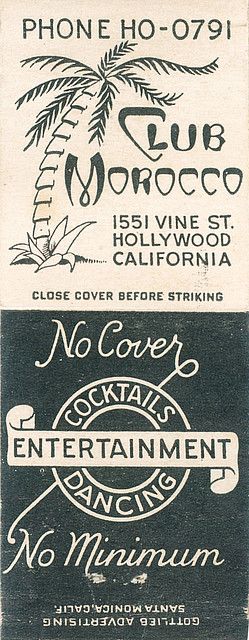
‘Club Morocco’ in Hollywood California. Date unknown of the matchbook but I would say 1940s/1950s, especially since there is a tiny video of the club below.

Vintage Matchbook from the 1940s / 1950s for Club Morocco in Hollywood, California.

Source: Pinterest

About the Club:

Historically, Club Morocco was opened in 1930’s and was located 1551 Vine Street in an area of Hollywood known as Radio City. Radio City was basically started by NBC in 1938. But shortly thereafter, the American Broadcasting Company (ABC) also located there. These famous radio studios were in close proximity to the Club Morocco, as well as, other famous clubs including the Brown Derby, the Hangover, and the Radio Room.
Club Morocco was quite the place to be in Hollywood for live entertainment and socializing of the era. The club was also had quite the beautiful Arabian theme with palm trees, camels, etc. decorations. The club was also a very popular venue for famous guest, movie stars, and other then important people of Hollywood and Los Angeles (Source).

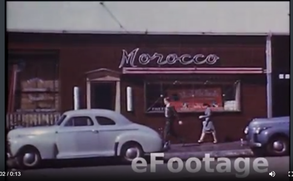
Video: Club Morocco in Hollywood featuring Red Nichols. A glamour Hollywood nightspot, seen in rare color film shot in the 1940s (click on image or HERE to view).

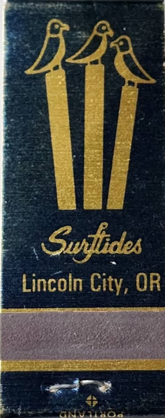
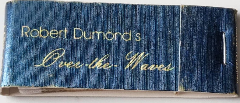
‘Surftides’ Lincoln City, Oregon – Robert Dumond’s Over the Waves Restaurant featuring an illustration of birds on pilings.

Surftides Lincoln City, Oregon - Robert Dumond's Over the Waves Restaurant featuring an illustration of Birds on pilings.
Surftides Lincoln City, Oregon - Robert Dumond's Over the Waves Restaurant

Source: Etsy- WhiteRobinVintage

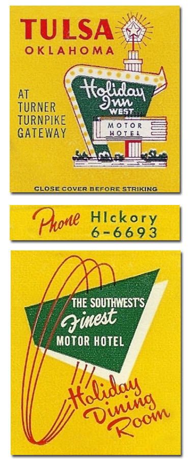
Visit Tulsa Oklahoma and stay at the ‘Holiday Inn West Motor Hotel’ at Turner Turnpike Gateway.

Further Reading: Mid-Century Motel/ Hotel Advertising

Mid Century vintage matchbook for the Tulsa Oklahoma Holiday inn West Motor Hotel featuring a Mid Century Sign.

Source: Pinterest

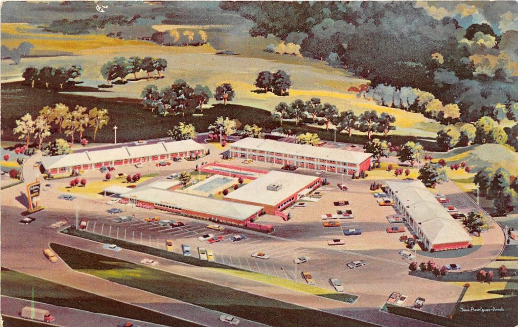
Here is a postcard of what the Tulsa Oklahoma Holiday Inn, looked like in the 1960s.

1960s vintage postcard: Tulsa Oklahoma 1960s Postcard West holiday Inn Motel

Source: eBay

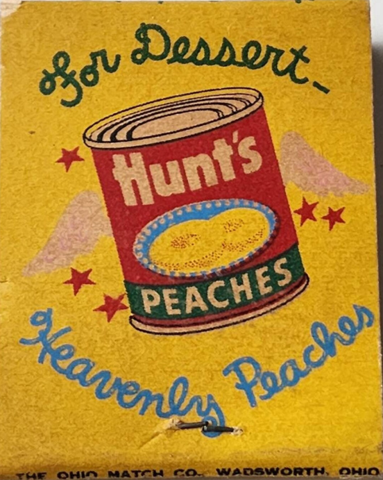
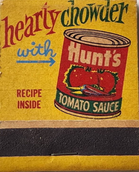
1950s matchbook with an image on one side “Hearty Chowder w/ Hunt’s Tomato Sauce” and the back side says, “For Dessert Hunt’s Heavenly Peaches.”

1950s matchbook with an image on one side "Hearty Chowder w/ Hunt's Tomato Sauce" and the back side says, "For Dessert Hunt's Heavenly Peaches."

Source: Etsy- WhiteRobinVintage

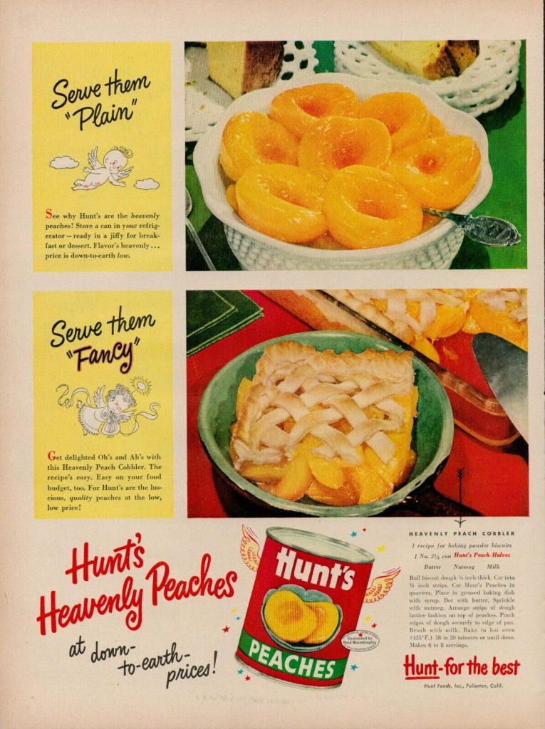
I found this fun 1951 Hunts Peaches ad featuring a recipe for Peach Cobbler. I thought I would share in case anyone is craving peaches now.

1950s vintage ad for Hunts Peaches ad featuring a recipe for Peach Cobbler from 1951

Source: eBay

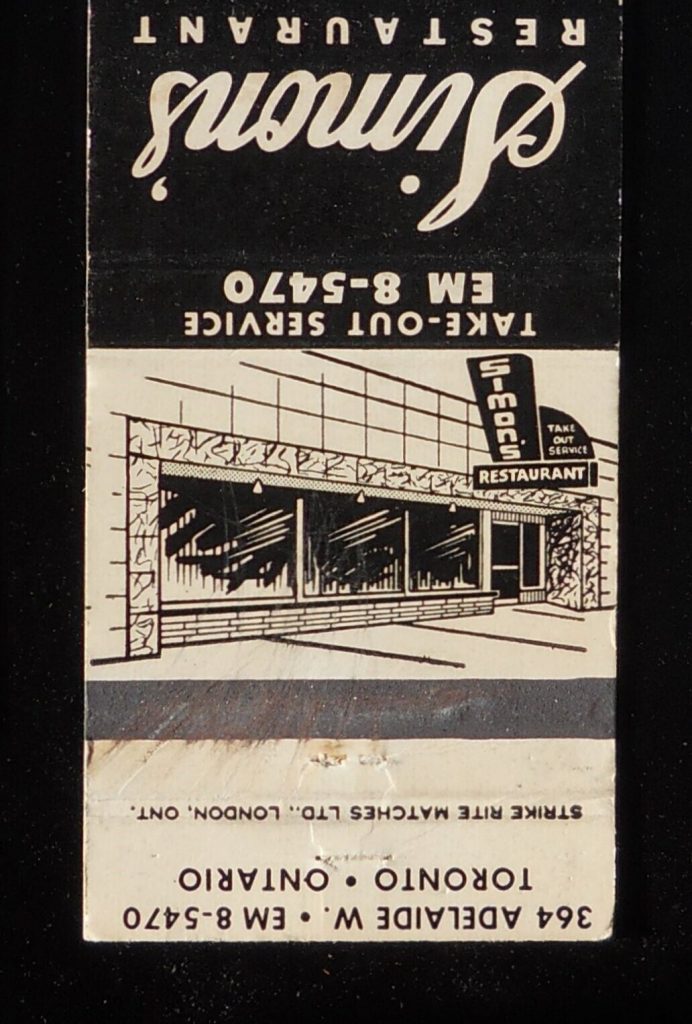
1950s Matchbook for ‘Simon’s Restaurant’ on Adelaide St. W. Toronto.

I could not find any information on this now gone restaurant but I really loved the sign so that is why I shared it. If you have any info please share in the comments section below. THANKS!

1950s Vintage Matchbook: 1950s Simon's Restaurant, 364 Adelaide Toronto ON Canada Matchbook

Source: eBay

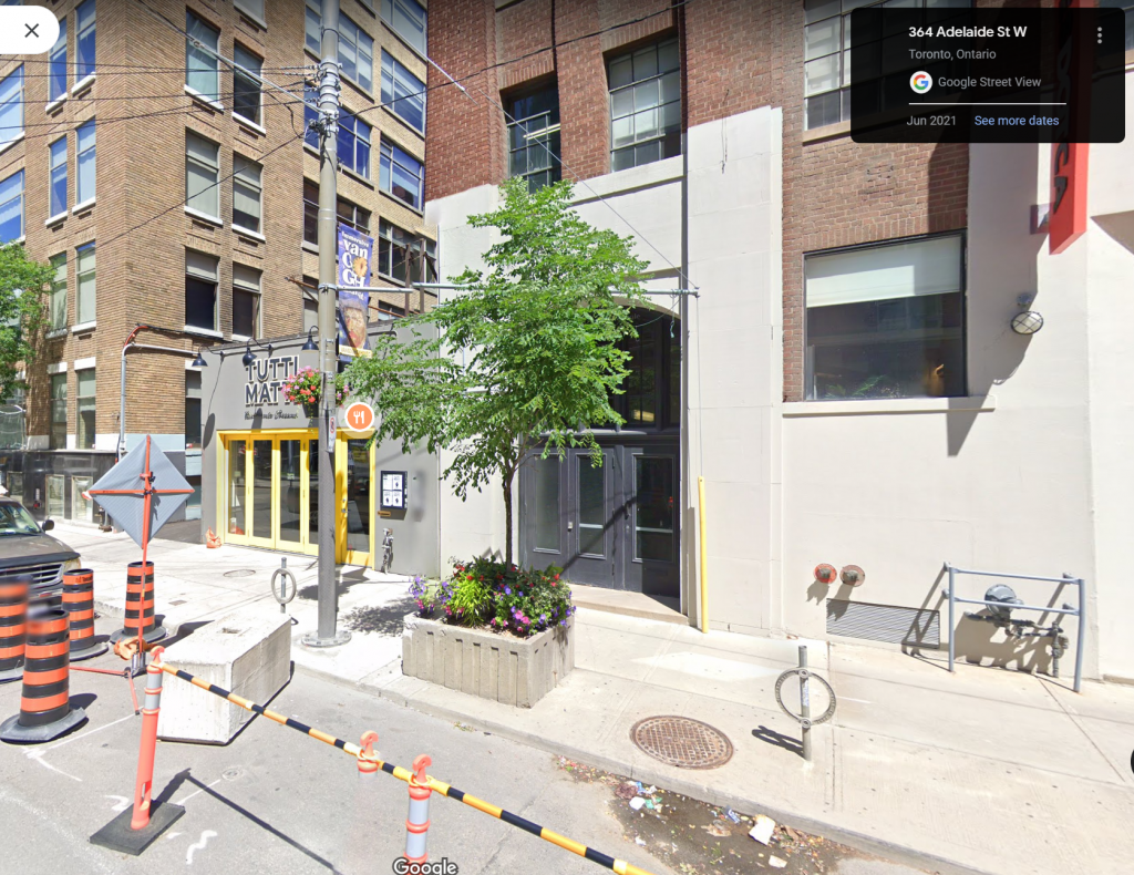
2023 Streetview of where ‘Simon’s Restaurant’ would of been in the 1950s.

2023 Streetview of where 'Simons Restaurant' would of been in the 1950s in Toronto Canada.

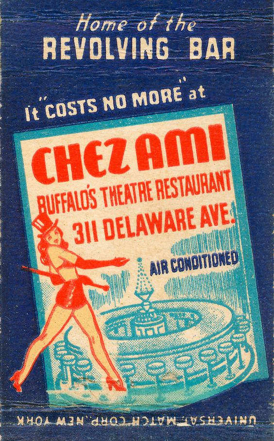
‘Chez Ami’, “Home of the Revolving Bar” in Buffalo New York.

Vintage Matchbook from the 1940s / 1950s for Chez Ami Buffalo's Theatre Restaurant the home of the revolving bar. Matchbook features an illustration of a showgirl and the bar.

Source: Pinterest

About the restaurant:

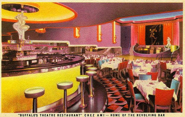
The Chez Ami, known as the Chez Ami Supper Club, was located at 311 Delaware Avenue in Buffalo, NY and first opened its door in 1934. It is considered one of the first supper clubs in the nation and had the first rotating bar in the United States. 

The interior of Chez Ami was designed by C. Theodore Macheras who used art-deco elements of mirrors, neon, indirect lighting and plush carpeting to achieve a modern entertainment experience. The centerpiece of Chez Ami was a revolving bar, purported to be the first of its kind in America, and- took 7 ½ minutes to make a complete cycle (Source).

Vintage Postcard: The Chez Ami, known as the Chez Ami Supper Club, was located at 311 Delaware Avenue in Buffalo, NY and first opened its door in 1934. It is considered one of the first supper clubs in the nation and had the first rotating bar in the United States.

Source: Wikipedia

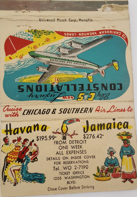
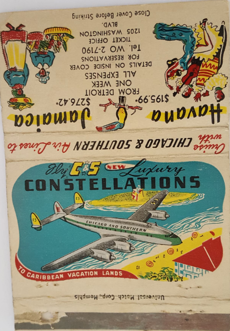
1950-1953 matchbook for Chicago & Southern Airlines to Jamaica & Havana (I love the colours!).

About:

The Chicago & Southern Airline started out in California but had changed their name in 1935, were a regional airline but this matchbook advertises their International destinations to Jamaica and Havana. Great representation of their “new” Luxury Constellations which were introduced in 1950 and by 1953 they were bought by Delta Airlines (Source).

1950s Vintage Matchbook:  Vintage circa 1950-1953 Billboard Matchbook for Chicago & Southern Airlines on new Luxury Constellations, Jamaica & Havana

Source: Etsy – SpottedDog1

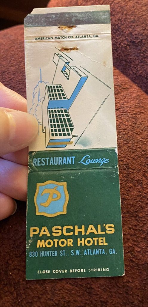
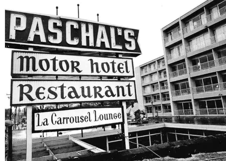
‘Paschal’s’ Motor Hotel / Restaurant in Atlanta Georgia.

History of Paschal’s:

It’s hard to know whether, back in 1947, James and Robert Paschal knew their sandwich shop (funded by pooling their savings from jobs like delivering newspapers and shining shoes) would leave such an important legacy. Yet because it was situated in Atlanta, the city where most key civil rights leaders were based, no soul food restaurant is more closely identified with the movement and its leadership.

After the business expanded to be Paschal’s Motor Hotel and Restaurant, the spot became the unofficial headquarters for civil rights organizers who were drawn in by the good food, especially the fried chicken, and the meeting spaces that were offered there. Ebony magazine noted in a 1979 profile of the Paschal brothers: “It was also at Paschal’s, in room 501 [of the hotel], that many, if not most of the civil rights marches were planned.” The Paschals also gave free food to protesters who had been arrested, jailed, and made bail.

Now in a downtown location, Paschal’s operates solely as a restaurant and no longer as a motel (Source).

Matchbook Cover Paschal’s Motor Hotel Atlanta Georgia

Source: eBay

Vintage photo of Paschal’s. I love the different fonts on the sign.

Vintage photo of Paschal's Motor Hotel / Restaurant in Atlanta Georgia. Civil Rights building.

Source: Southern Living

I was just in Tokyo, Japan for 4 days so I thought sharing these matchbooks from the ‘Imperial Hotel’ was timely.

Vintage Matchbooks, Imperial Hotel, Tokyo, Japan

Source: Etsy – GinGroveInn

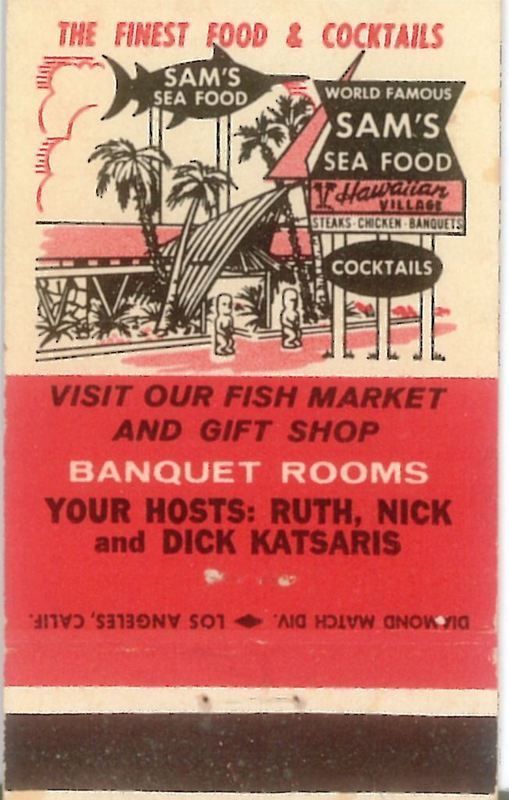
‘Sam’s Seafood’, Sunset Beach’s orginal Polynesian Palace.

Vintage Matchbook for SAM’S SEAFOOD, SUNSET BEACH’S ORIGINAL POLYNESIAN PALACE

Source: Pinterest

History of Sam’s Sea Food:

Originally opened in 1923, Sam’s Seafood was opened by Greek-immigrant brothers Sam and George Arvanitis in nearby Seal Beach. It was first a bait shop, then a fish market, and then, by the 1940s, a restaurant.

The swordfish was almost instantly iconic. It began appearing on everything from postcards and matchbooks to coasters. The restaurant had a variety of different names, from Sam’s Seafood Spa, to Sam’s Seafood Grotto and a variety of other things.

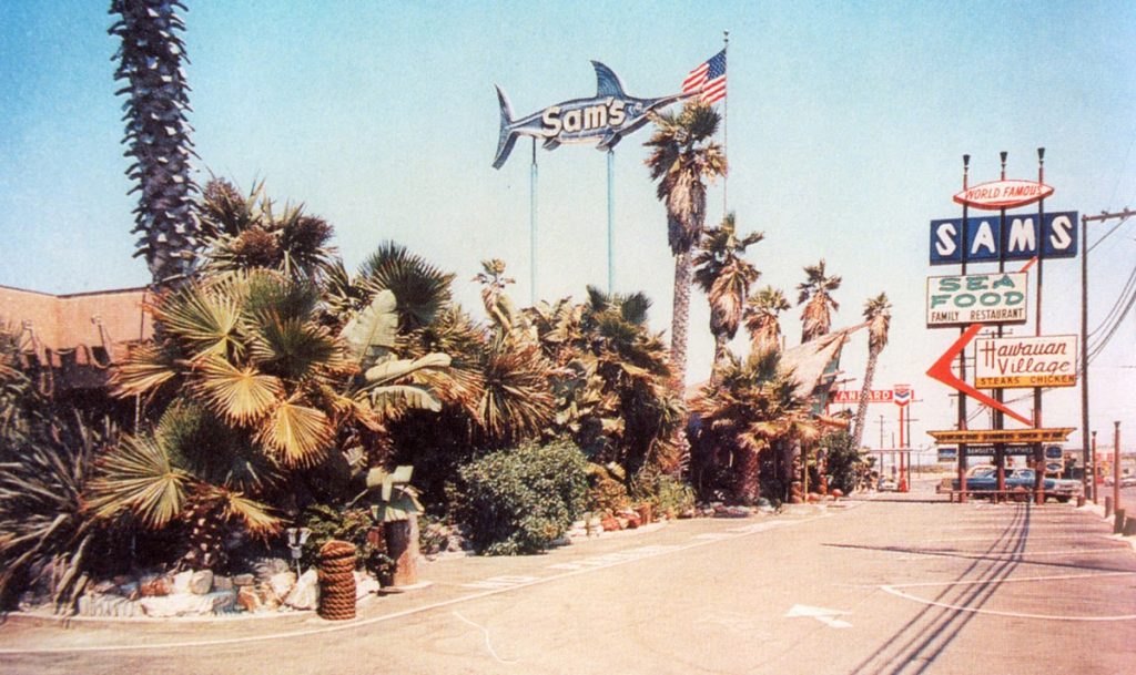
In February 1959, the place was destroyed by fire and so the family created what many locals know and love as Sam’s Seafood, a new restaurant designed with a spectacular Tiki theme in a building that also featured a Hawaiian Village (Source).

Vintage photo of SAM’S SEAFOOD, SUNSET BEACH’S ORIGINAL POLYNESIAN PALACE

Source: OCWeekly

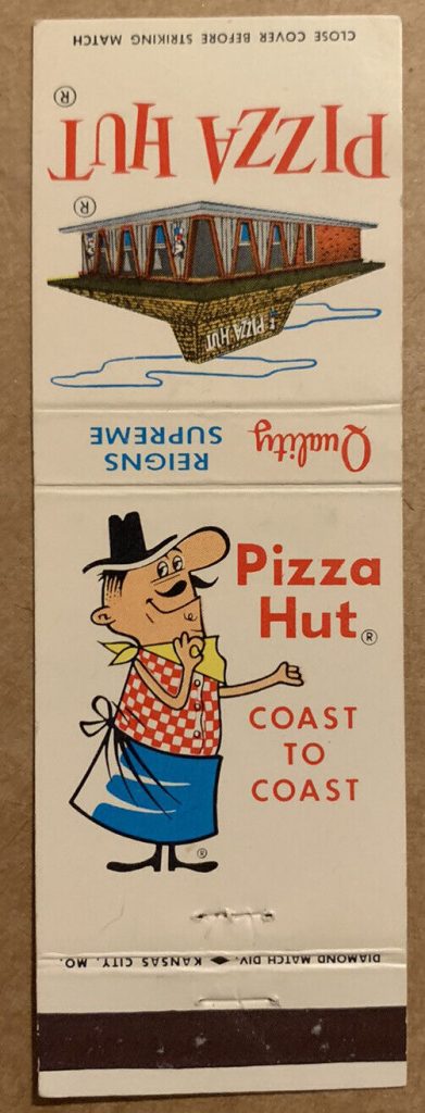
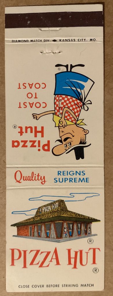
1960s restaurant matchbook for ‘Pizza Hut’. “Coast to Coast” & “Quality Reigns Supreme”.

The brief “early day’s” history of the restaurant:

In 1958, two brothers borrowed $600 from their mom to open a pizza place in Wichita, Kansas. They named it Pizza Hut, because their sign only had room for eight letters.

Six months later they opened a second outlet, and within a year they were operating six locations.

The brothers began franchising in 1959 (source).

1960s Restaurant Matchbook for PIzza Hut featuring an illustration of the restaurant and a man in an apron.

Source: eBay

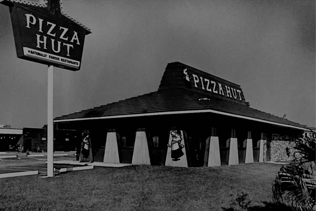
1960s vintage photo of the iconic Pizza Hut building style, designed in 1963 by Chicago architect George Lindstrom and was implemented in 1969 (source).

1960s vintage photo of The iconic Pizza Hut building style was designed in 1963 by Chicago architect George Lindstrom and was implemented in 1969

Source: Pizza Hut

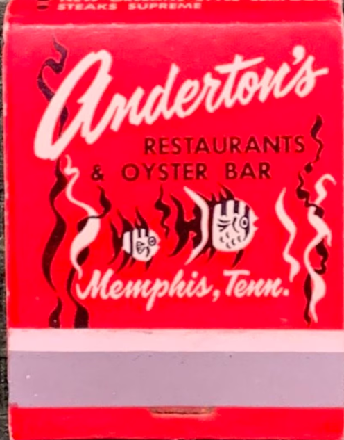
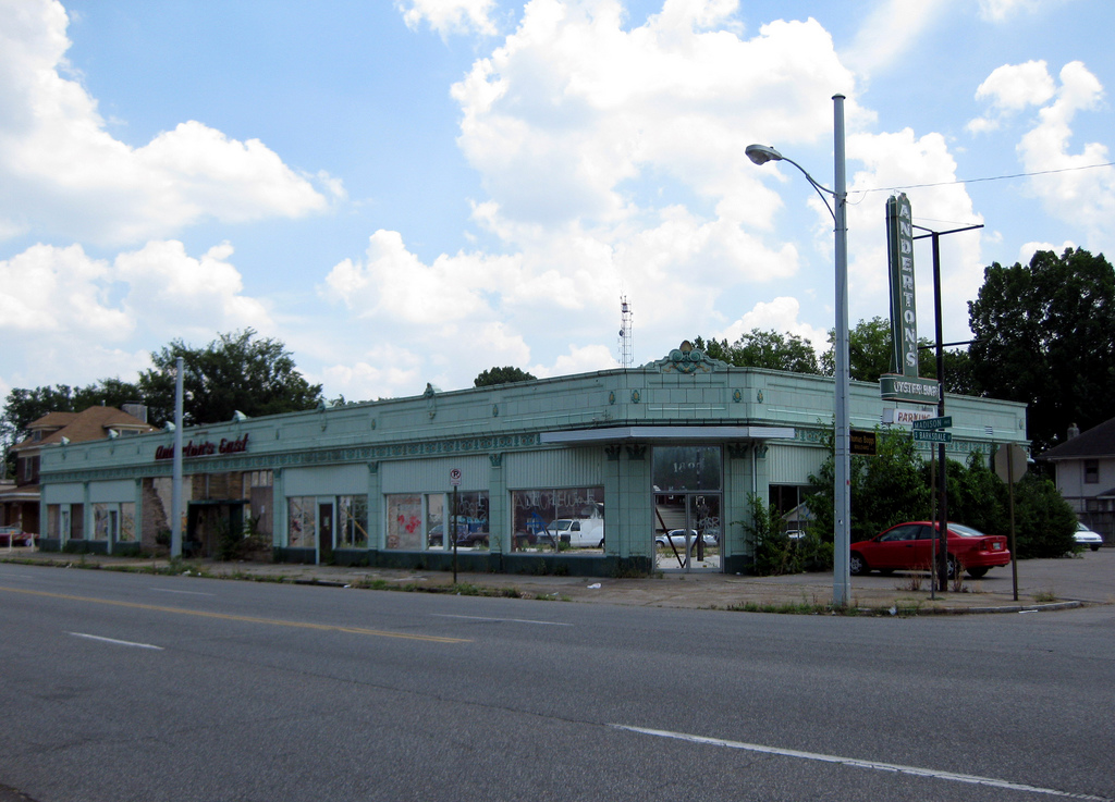
I love a good fish illustration, as seen on the ‘Anderston’s Restaurants & Oyster Bar’ matchbook in Memphis, Tenn.

Vintage Matchbook for Andertons, Oyster Bar & Restaurant, Memphis, TN featuring an illustration of fish in the ocean.

Source: Etsy – GinGroveInn

History of Anderton’s:

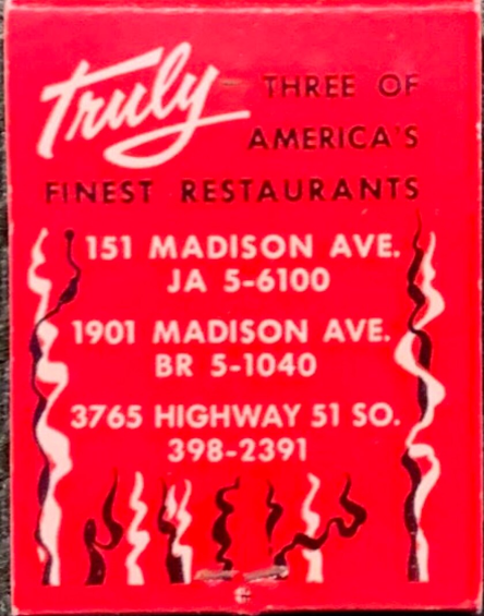
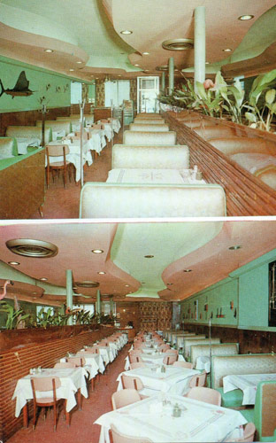
Anderton’s Restaurant and Oyster Bar originally opened downtown in 1945 at 151 Madison. A second location was added in 1956 as Anderton’s East at 1901 Madison. Herbert Anderton, closed the Downtown location in 1975 and consolidated the business into Anderton’s Restaurant. His son later took over the restaurant. The restaurant had chefs who remained for as long as 50 years. Linda Anderton managed the front of the restaurant while her husband oversaw the food.

Photo of Anderton's Restaurant and Oyster Bar in Memphis Tenn.

Source: Historic Memphis

The restaurant’s distinctive sea-foam green colors and nautical theme as well as the location’s diverse patronage, attracted Hollywood movie makers who shot scenes for the films “21 Grams”, “Walk the Line”, and “The Client” at the restaurant. Anderton closed the restaurant in 2005 (Source).

Vintage photo of Anderton's Restaurant & Oyster Bar distinctive sea-foam green colors and nautical theme.

Source: Historic Memphis

That is the end my fantastic readers!

I loved doing this post…a lot! Like way more then I thought I would when I started it. I loved researching the locations of the matchbooks, I loved reading their history and I loved sharing them here. I hope you enjoyed this post as must as I did (stay tuned at some point for a part 2).

Please share any thoughts you have about vintage matchbooks in the comments section below.

Further Reading: Vintage Advertising 1920s-1960s (Archived blog posts)

Thanks for dropping by!

Liz